Elasticsearch is primarily known for it’s search capabilities but it’s also very well suited for storage, aggregation, and querying of time series data. In this tutorial, we’ll learn how to use Elasticsearch to store simple metrics and visualize them with Kibana.
To summarize, we’ll generate dummy signup data with this script. Ingest it into locally running Elasticsearch. Use Kibana to visualize the data in different ways. For simplicity, we are not using Logstash in this tutorial but you can easily configure the same data to be ingested through Logstash. Let’s dive in!
Setup
- Download and setup elasticsearch on your machine.
- Download and setup kibana on your machine.
Generate Data
Imagine you own a service to help reduce cloud cost for companies. You have signups coming in from different countries, sources of referrals, and with different monthly cloud spend. Let’s use Elasticsearch+Kibana to visualize this data better. A typical signup entry looks like this:
{"metricCount": 1, "referrer": "HN", "client": "AndroidApp", "monthlySpend": 7632, "country": "U.K.", "signedUpOn": "2018-01-19T19:44:32", "metricName": "Signup"}
You can generate the entries with this python script or download this sample data file directly. The format is optimized to suit _bulk endpoint of Elasticsearch.
Create Index
Let’s create an Elasticsearch index to store the data. You can either create it with this curl command:
# CREATE INDEX

curl -XPUT "http://localhost:9200/signups" -H 'Content-Type: application/json' -d'
{
  "mappings": {
    "signup": {
      "properties": {
        "metricName":   { "type": "keyword" },
        "metricCount":  { "type": "integer" },
        "monthlySpend": { "type": "integer" },
        "client":       { "type": "keyword" },
        "country":      { "type": "keyword" },
        "referrer":     { "type": "keyword" },
        "signedUpOn":   { "type": "date" }
      }
    }
  }
}'
Or through discover tab on Kibana:

Insert Data
Insert the generated data into this newly created index.
 # Bulk load data
curl -s -H "Content-Type: application/x-ndjson" -XPOST "http://localhost:9200/signups/_bulk" --data-binary "@signups.csv"; echo
Validation
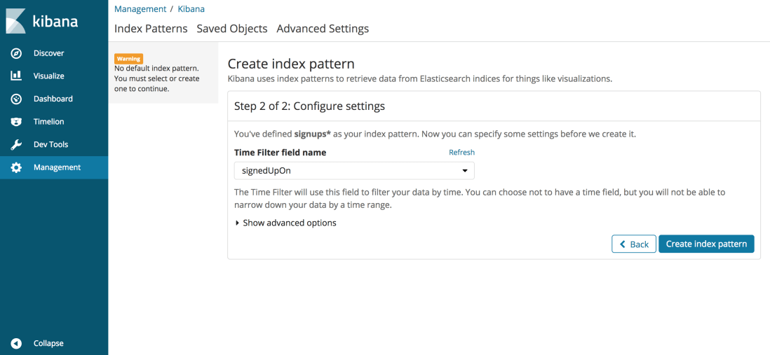
Let’s make sure that the data is inserted into Elasticsearch and visible in Kibana. Hit local Kibana endpoint and click on the Discover tab. You should see the following UI, enter the index name (signups) and hit Next Step. 
On Step 2, enter the Time Filter Field name as “SignedUpOn” to order the data by signup time.
Now go to the Discover tab in Kibana, choose last 30 days as duration and see all of the inserted data is available.
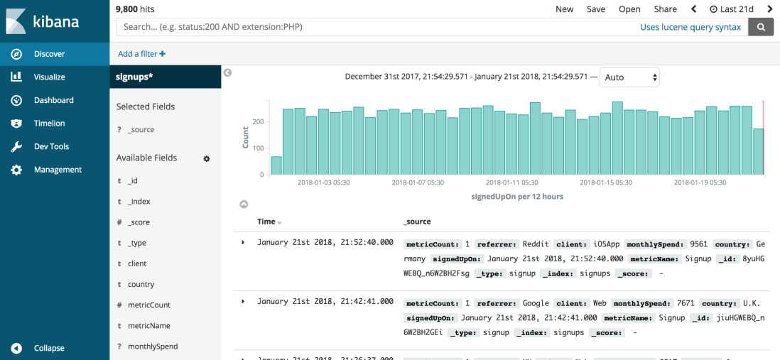
Congratulations, your data is now available through Kibana. Let’s see it in action!
Visualizations
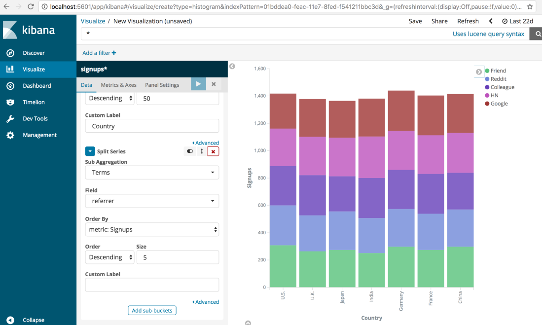
Go to the Visualize tab & select the type of graph you want.

Let’s select the Vertical Bar and set the X & Y axis as shown below to see signups by country. We can further restrict the result by time (upper right corner) or any other dimension (e.g. client, referrer). Conditions for other dimensions should be put in the text bar at top (e.g. client:AndroidApp).

We can also apply logical operators AND, OR to restrict the result.

Bar graph of signups can further be split by type of referral. This is achieved by adding sub-bucket of type split series. From this graph you can tell which type of referrals work well in what country. Sadly our randomiser has generated data pretty evenly across all buckets so not many conclusions to draw, but your real data will have insights worth digging in.
We can also plot monthly $$ spent on cloud infrastructure by our signups, split across countries and various percentile points. This will help you choose & focus on your target customer segment. Percentile also comes in pretty handy when you are plotting DevOps metrics like latency.

You can add these metrics to Kibana dashboard and share it with your team. I hope this gives you a sense of what’s possible with Elasticsearch+Kibana visualizations. There are lot more visualizations available including maps, heatmaps, piechart and what not. I recommend learning more about it with fantastic videos on Elastic.co
If you want to go a step further and build reporting, monitoring, alerting through Elasticsearch metrics, check out the X-pack offering (paid) by Elastic. Share your thoughts in the comments section and follow the blog if you enjoyed reading this.

Thiss was lovely to read
LikeLike